Our latest updates mean Planwisely users get an expanded data library, advanced drawing tool features and more. Find out what’s new.
Q4 2025 People Movement Data
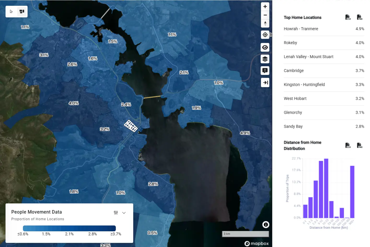
The latest completed quarter of data is now available within Planwisely’s People Movement Data and its suite of analytics tools: Trips, Home Locations, Length of Stay and Heatmaps.
Why it matters: You can analyse changes in how people move across aggregated or isolated quarters of the year in Planwisely’s People Movement Data modules (Q1 2019 – Q4 2025), allowing you to analyse changes over a broad period of time and with up-to-date data.
Home Locations is one of four People Movement Data tools that also includes Trips, Length of Stay and Heatmaps to understand mobility in Australia.
Advanced drawing tool features
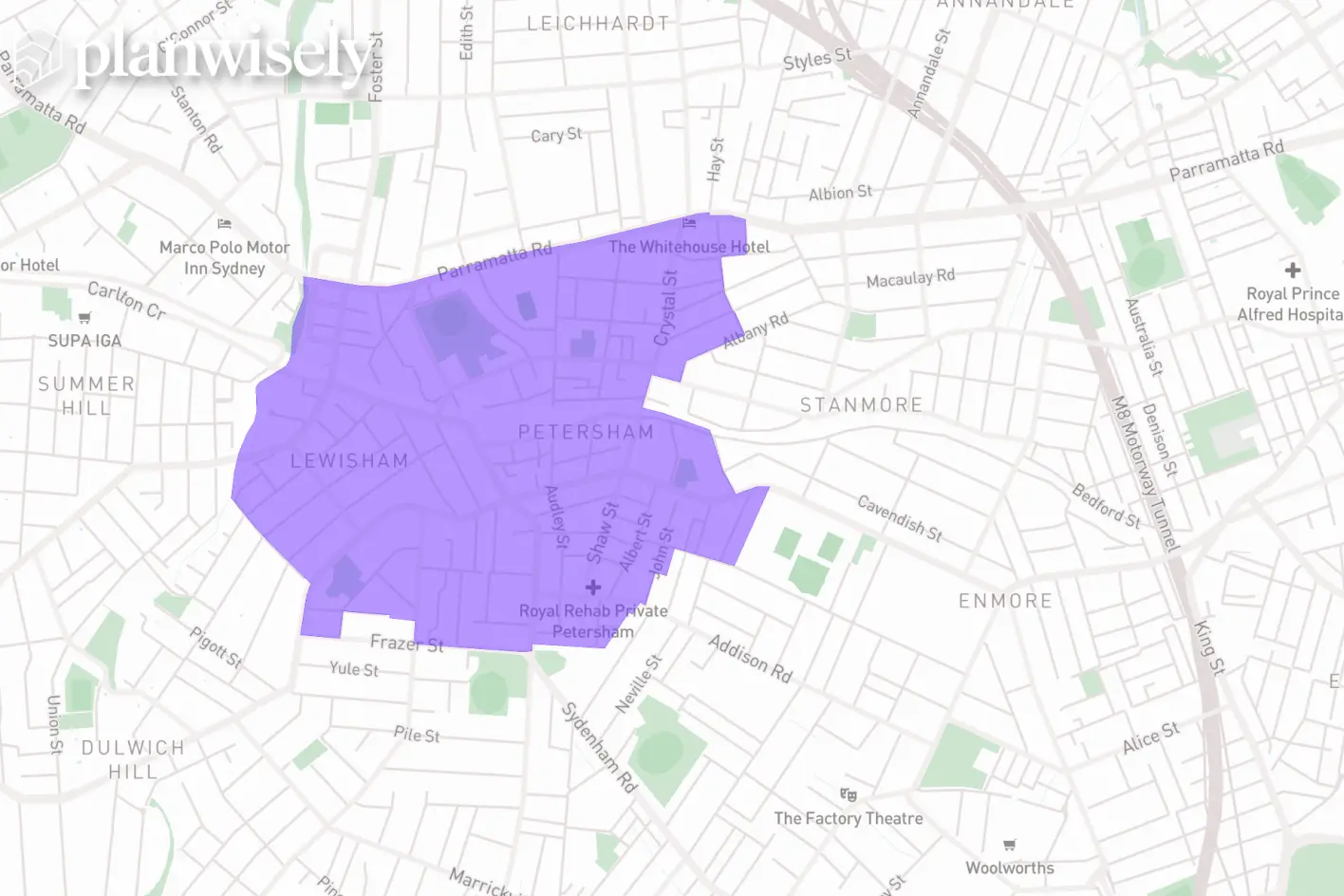
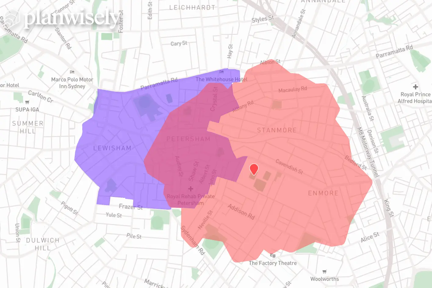
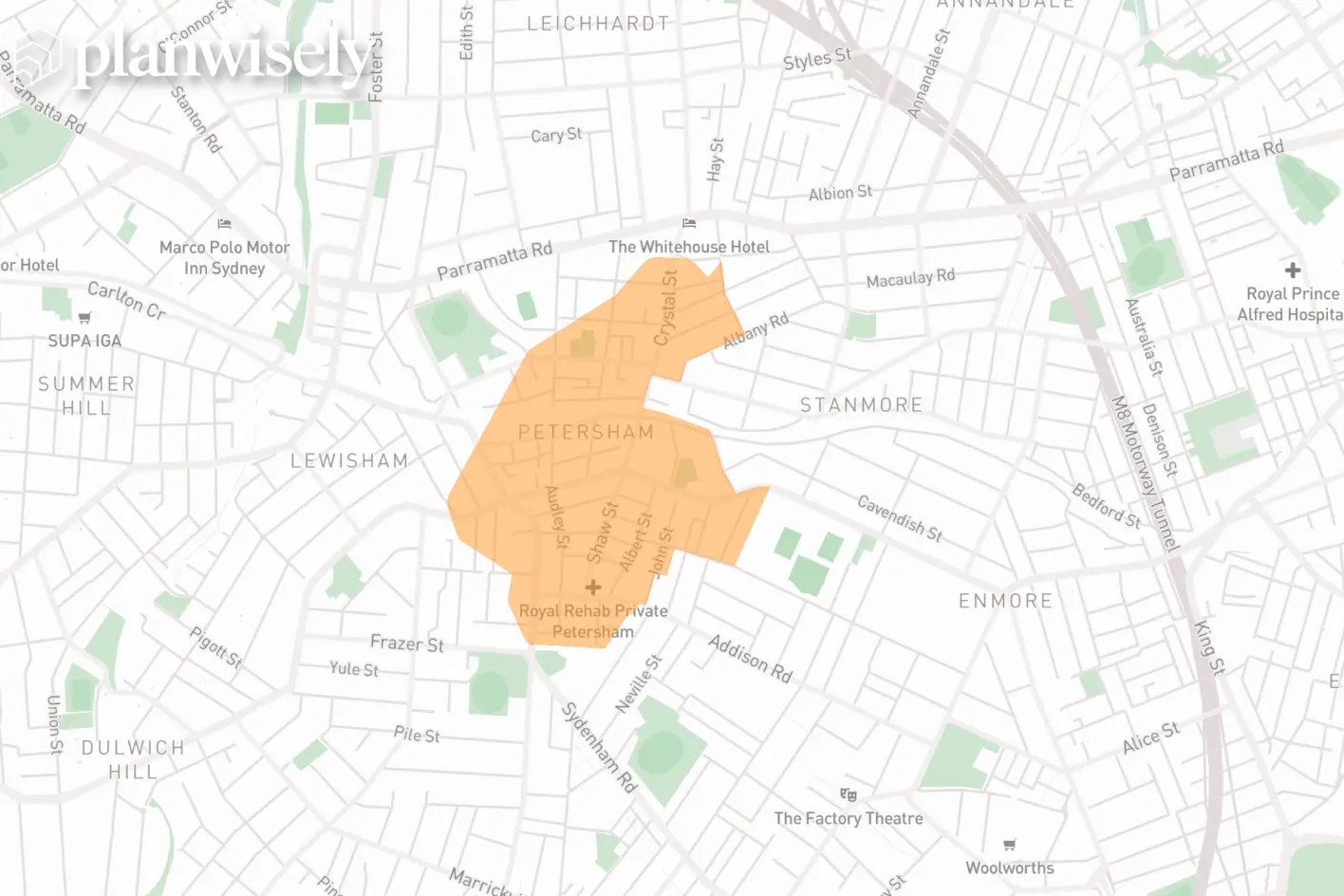
The drawing tool has been expanded with new features that make it more flexible and functional. You can now:
Create shapes using boundaries like suburbs, LGAs and meshblocks to run demographic reports for specific areas, visually highlight them and more
Create new shapes from where two or more existing shapes overlap (such as two 10-minute walk catchments visualised on the map)
Create a ‘mask’ around a shape to get creative with maps by visually isolating an area
Access a new, wider range of map icons and symbols for your maps
These new features give users greater analytical power and visual control over what’s displayed on the map.
New drawing tool features like creating shapes from boundaries, masks and more are now in Planwisely.
State persistence
With new features and layers to customise your map view consistently being added to Planwisely, you can now reload and navigate away from your area of investigation while retaining your current visualisation's filters, custom binning and more.
Why it matters: State persistance allows you to pick back up your analysis exactly where you left it. This is particularly useful for complex map visualisations and analysis.
Demographics
Several new layers including Ancestry, Labour Force Status, and Level of Education join an already-extensive library of demographics layers available in Planwisely.
Why it matters: Understanding communities at a deeper level helps you make better location, planning and investment decisions. Planwisely users can now develop richer customer profiles, assess workforce capacity and tailor services to the cultural and socioeconomic reality of each area.
Business
Two new business-related data layers are now available in Planwisely: Business Counts, which lets you explore active businesses by industry, and Australian Agriculture, which you can use to investigate a range of production statistics across 14 different crops.
Why it matters: Local economic activity is one of the clearest indicators of market opportunity. These new layers can help you identify viable trade areas, market gaps and regions experiencing growth or decline.
Ask us about specific data layers in Planwisely today
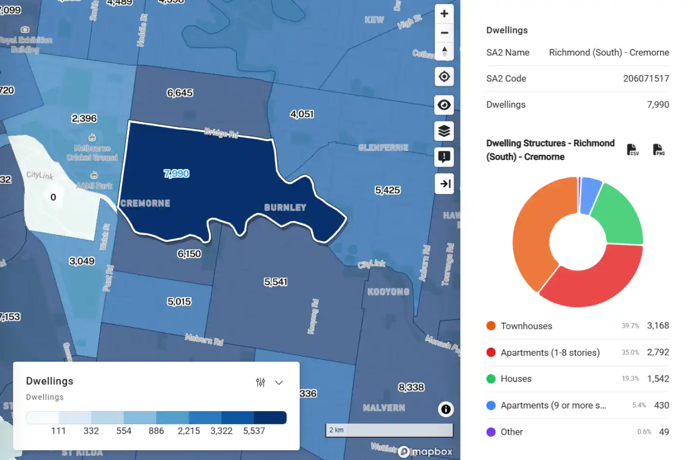
A new Dwellings layer has been added in the Land Use and Planning category, which you can use to explore housing stock across Australia. Within this is a new Housing Utilisation layer that allows you to analyse spare bedrooms across the country.
Why it matters: Housing stock influences everything from infrastructure demand to retail performance. The new Dwellings and Housing Utilisation layers reveal where spare capacity exists and where households are under pressure, supporting more accurate planning assessments, development feasibility studies, and community services forecasting.
Solar Installations
You can now view solar installations by postcode (courtesy of the Clean Energy Regulator) with information on the number of solar and battery installations, solar installations over time and overall solar and battery capacity (kW) for the area.
Why it matters: Energy transition trends can reshape household costs, development feasibility, and policy priorities. Solar installation data helps you monitor clean energy adoption and understand where renewable infrastructure is accelerating.
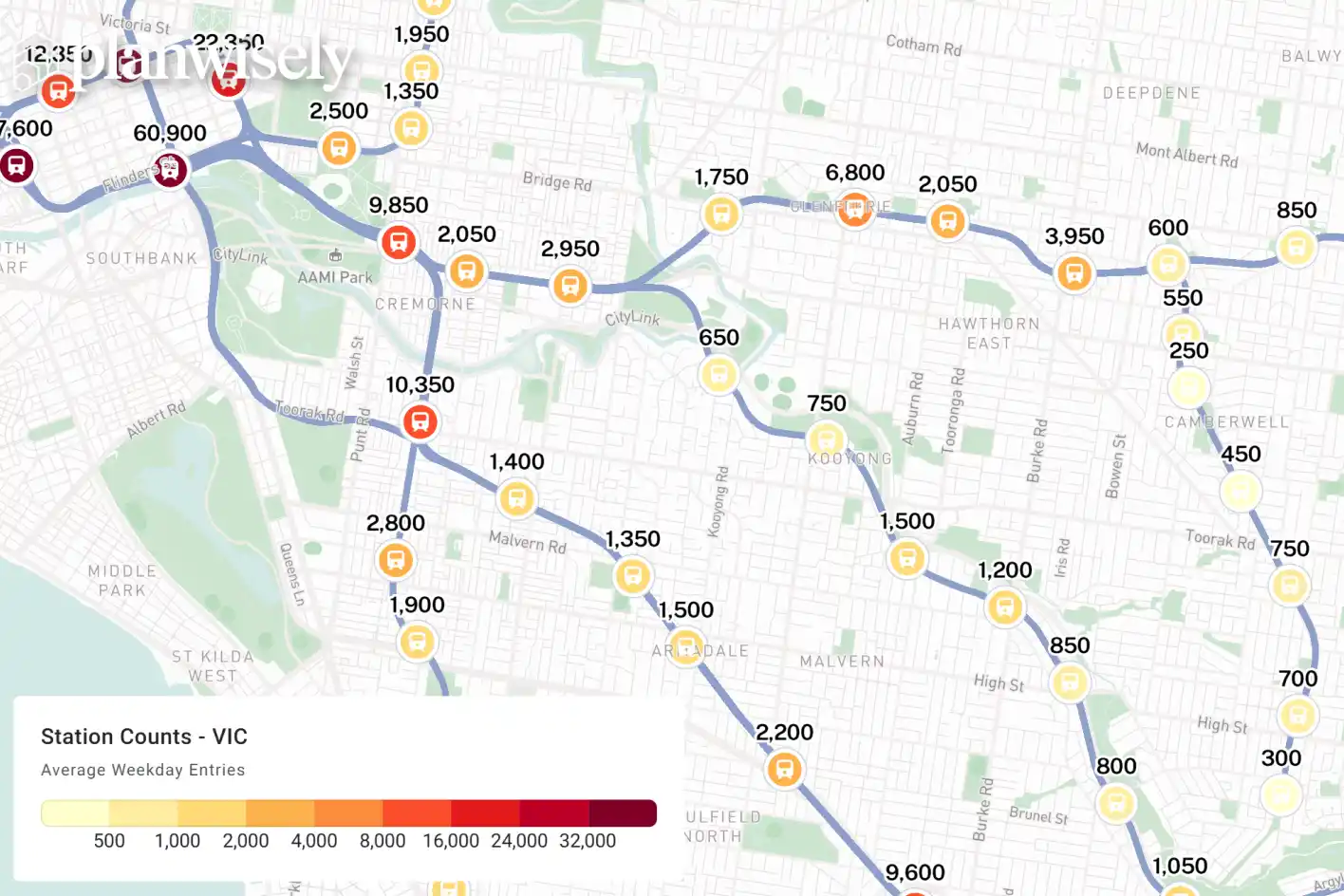
Station Counts
Rail station counts are now available in all states and territories except Western Australia. Select a station on the map to view daily average boardings and alightings, which are directly taken from state published sources.
Why it matters: Public transport access is a strong predictor of how people move and urban development. With station boarding and alighting counts you can quickly identify high flow transit nodes, support assessments and target locations with strong movement patterns.
Personal income
Detailed income information from FY2022-23 tax returns (at an SA2 or LGA level of granularity) is now available within Planwisely's Demographics layer library.
Why it matters: Income distribution is a core input to market sizing, customer segmentation, and socio‑economic analysis. This data gives you an understanding of financial capacity at a local level, which can be used to inform retail network decisions and assess economic resilience in specific locations.
NSW Development Applications
Planwisely now includes every Development Application tracked in the NSW Planning Portal. You can view DAs on the map as individual points or as a heatmap to make spotting growth areas easier.
Why it matters: Visibility into development activity helps you anticipate growth before it appears in official statistics. This data enables faster identification of emerging corridors, future demand and areas attracting strong investment.

.jpg)
.webp)

.jpg)
