
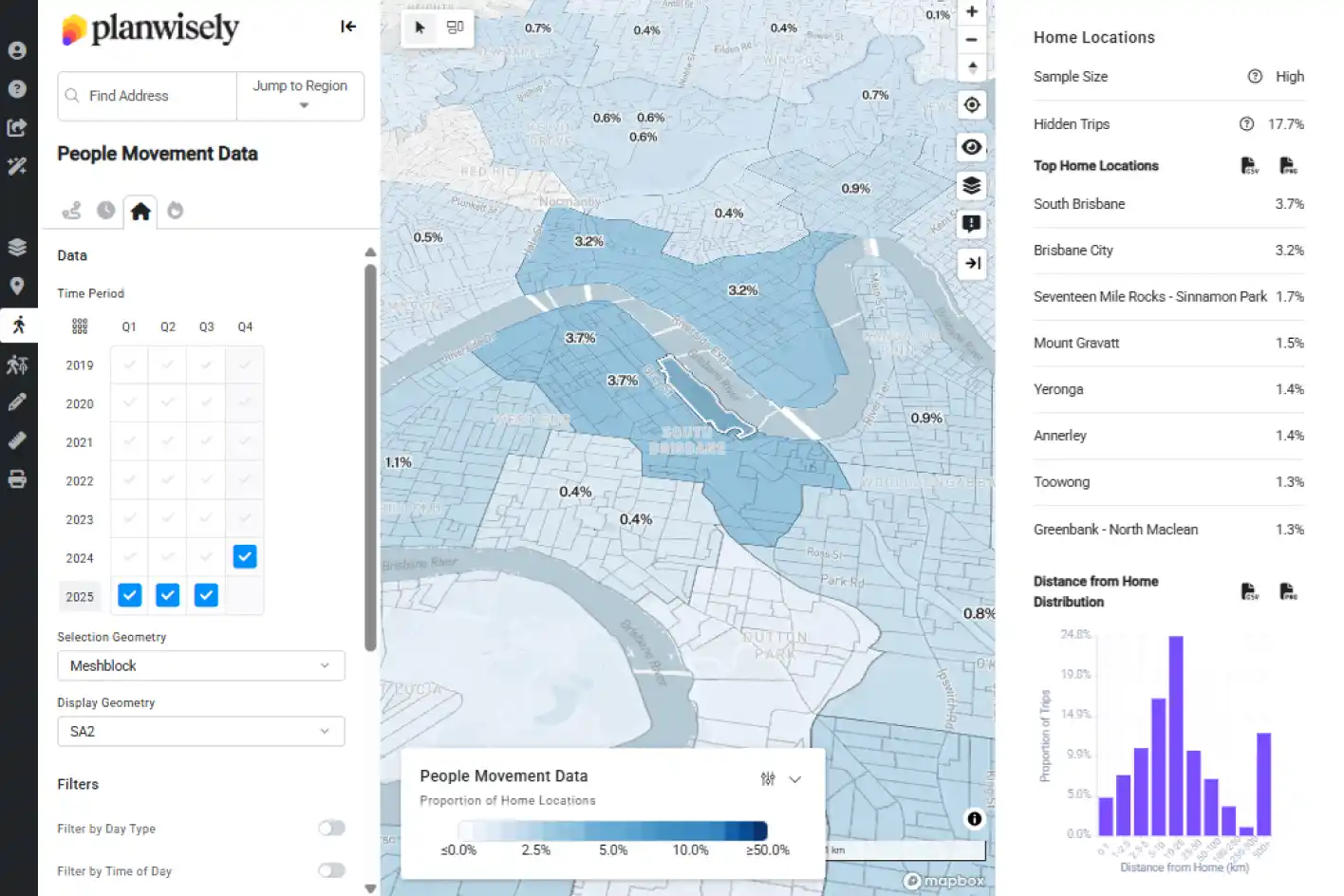
Q3 2025 People Movement Data
The latest completed quarter of data is now available within Planwisely’s People Movement Data and its suite of analytics tools: Trips, Home Locations, Length of Stay and Heatmaps.
Why it matters: You can analyse changes in how people move across aggregated or isolated quarters of the year in Planwisely’s People Movement Data modules (Q1 2019 – Q3 2025), allowing you to analyse changes over a broad period of time and with up-to-date data.
Layers search
The Planwisely data library has 100s of data layers to choose from, and you can now search for them quickly and easily with a handy search bar.
Why it matters: You can find the data layer or layers you need with keywords. Using the layer search isn’t just quick, either – search terms can help you find related data layers that might help in your analysis.
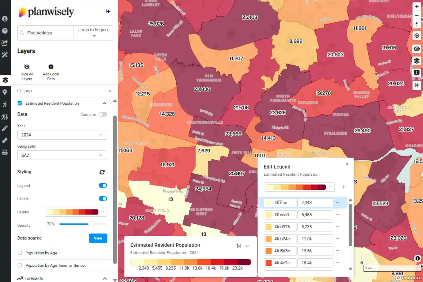
Custom binning
Tailor how datasets are displayed on the map by customising the numerical brackets and colouration of distinct categories or ‘bins’.
Why it matters: By adding, subtracting, adjusting or colouring distinct ‘bins’ that help distinguish the data being shown on the map, you have the flexibility to finesse your analysis and find more meaningful insights from a given data layer.
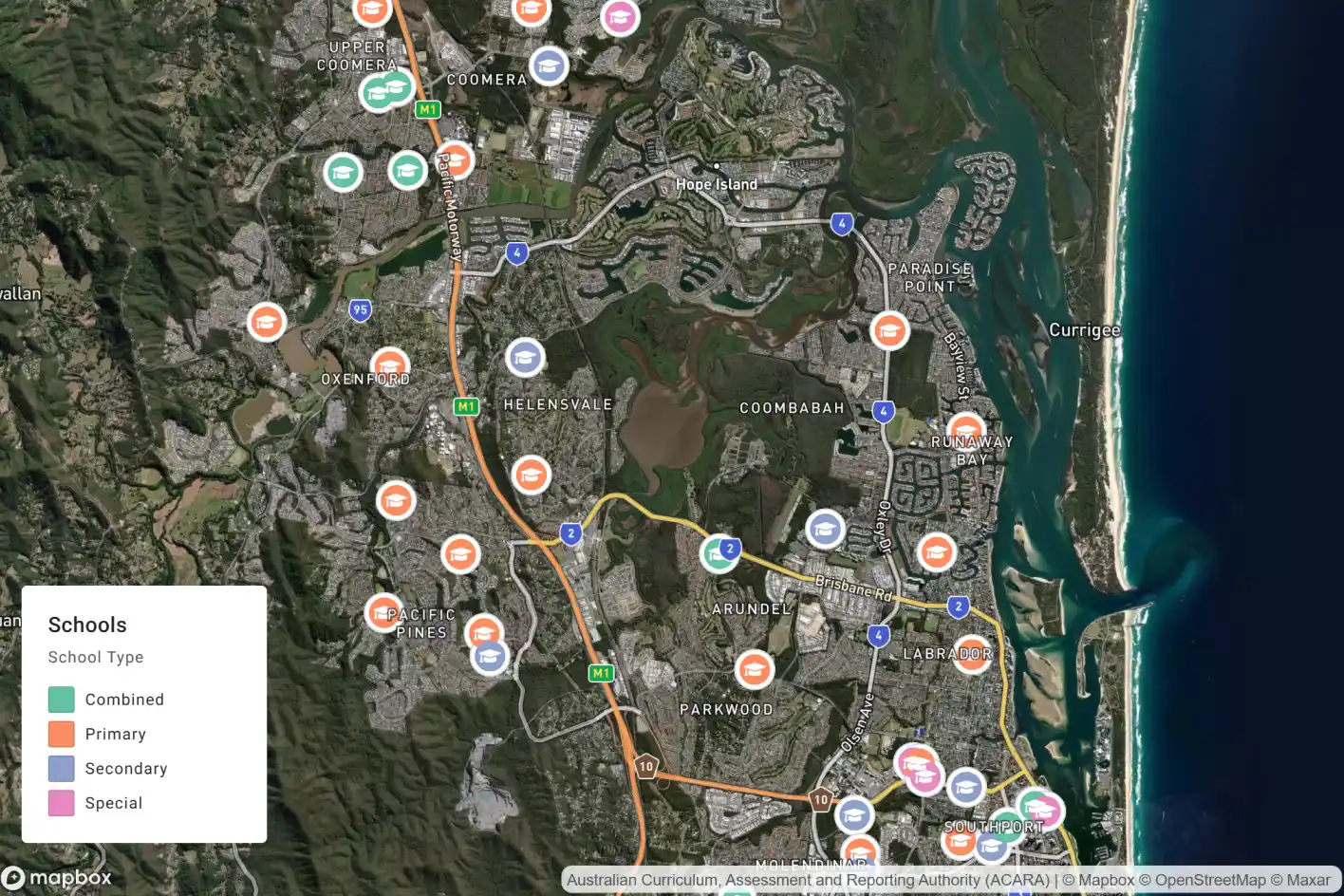
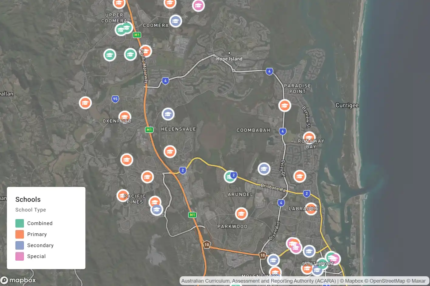
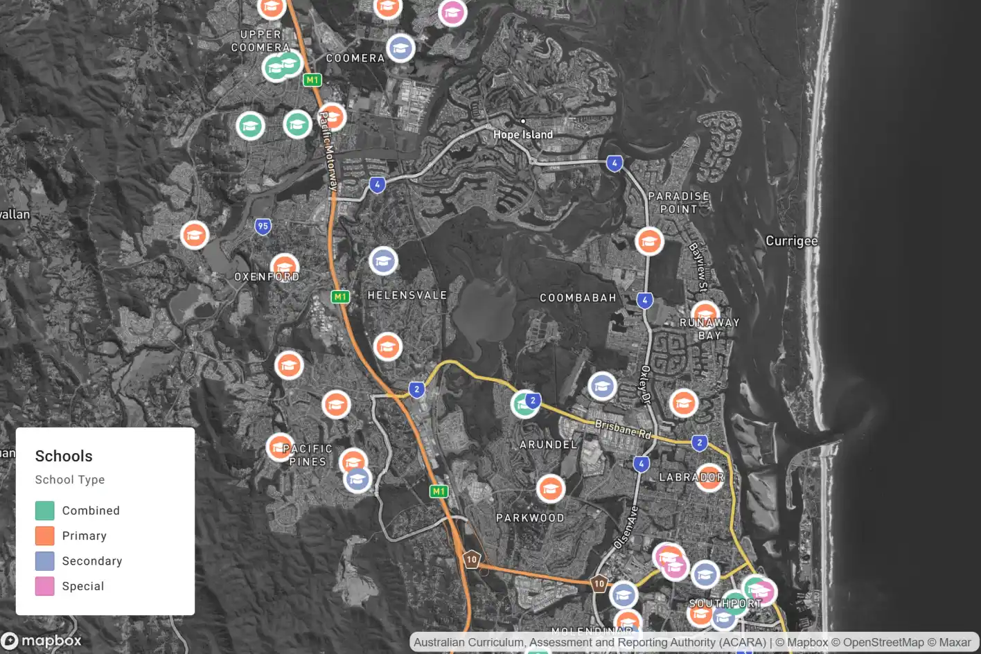
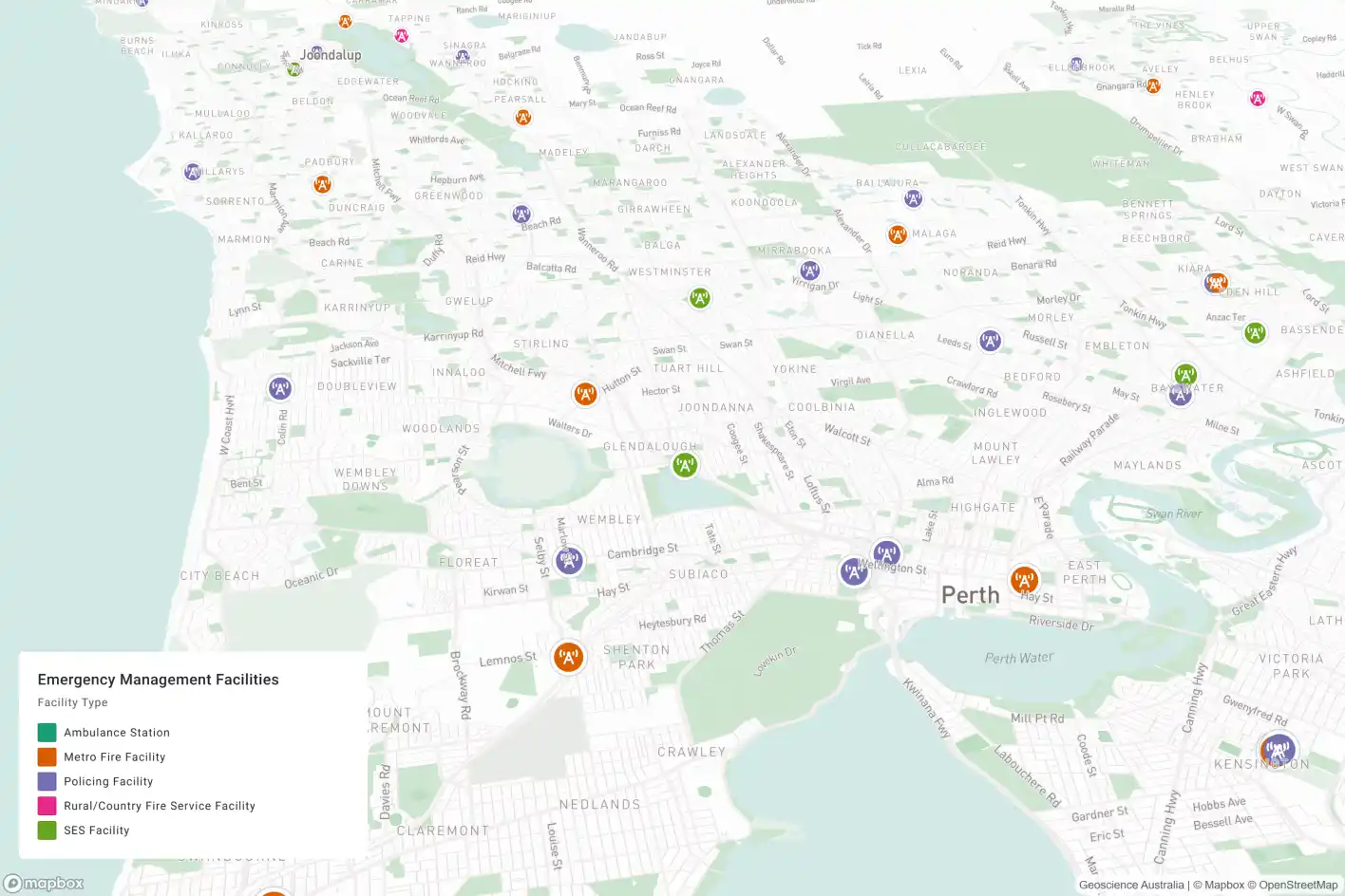
New satellite map styles
Make your data stand out on the Satellite map layer with two all-new styles: Faded and Black and White.
Why it matters: Desaturating satellite imagery allows you to retain a high level of realism in your map view while ensuring the data on it has maximum visual impact.

.jpg)

.webp)
.webp)
