After the release of PATH for active transport planning, our team have been busy releasing a raft of new datasets and updated tools.
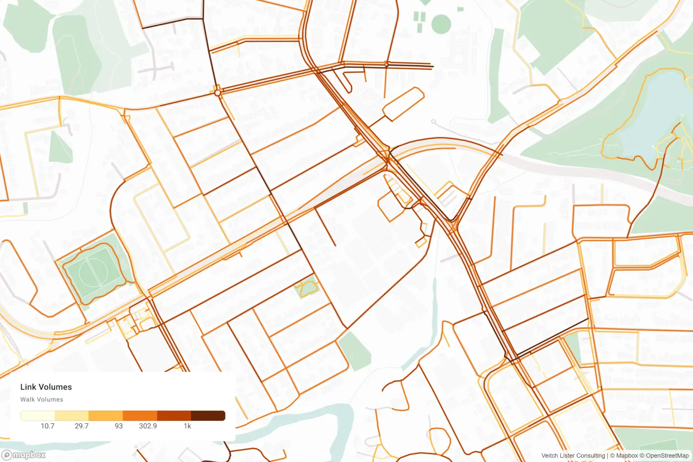
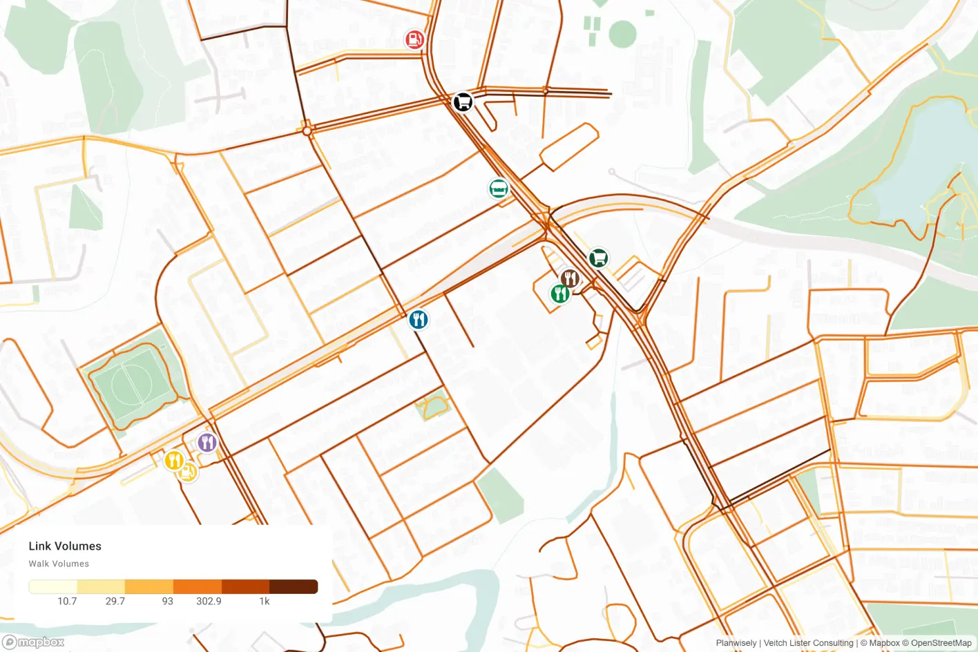
Foot Traffic Data
Foot Traffic Data is a powerful nationwide pedestrian activity dataset for analysing walking travel volumes and pedestrian flows at street level. Users can investigate how many people walk on a given street or link and analyse how pedestrians flow through them to understand walking travel patterns.
Why it’s useful: Knowing how many people walk and where they tend to travel to and from can be used to measure place performance and understand who is visiting on foot and why. These insights are incredibly valuable to a range of real-world business and planning outcomes that rely on or benefit from robust pedestrian movement insights.
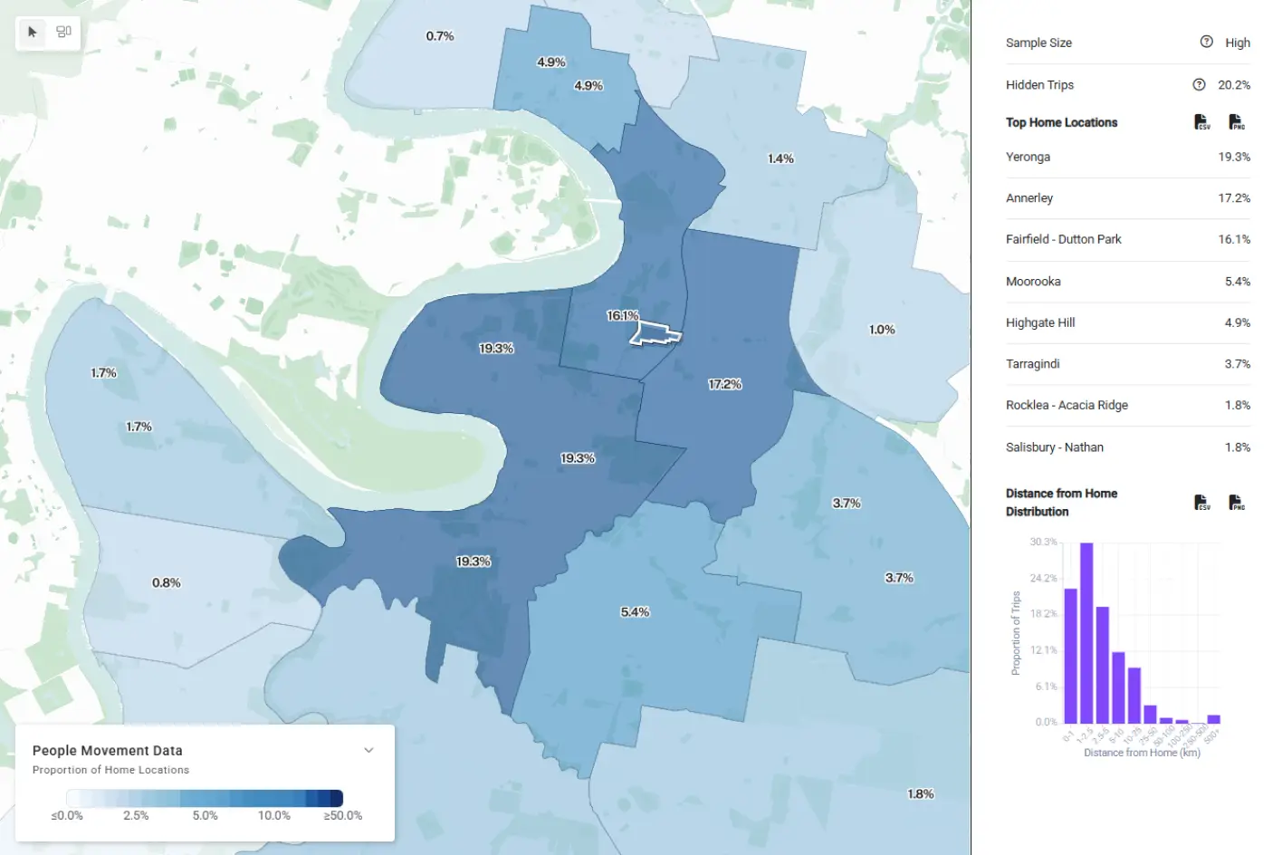
Home Locations
Home Locations is an exciting new tool within our People Movement Data module that allows users to select an area on the map and see where its visitors come from. It’s possible to explore visitation trends across different quarters, years, days of the week or time of the day, as well as travel distance, geography or by distance from home.
Why it’s useful: Knowing where people’s journeys originate from presents us with a deeper understanding of who and why people are visiting a location. Home locations insights can be used to analyse catchment areas, accessibility, connectivity, place performance and more for tourism, site selection, economic development, traffic and transport, urban design, recreation planning and more.
The Home Locations tool leverages People Movement Data to analyse where visitors to a place or area have come from.
Station Catchment Data
This new dataset, which is powered by granular GPS mobility data (People Movement Data), visualises pedestrian travel to and from individual train stations to understand how people access them and identify patterns of movement around them.
Why it’s useful: Station Catchment Data offers traffic and transport planners specific insights to improve access and connectivity to train stations by visualising their pedestrian catchments.
The Station Catchment tool lets you understand pedestrian access to and connectivity around train stations.
Urban Heat Islands (all capital cities)
CSIRO land surface temperatures and urban heat island estimates for all capital cities in Australia are now available in Planwisely.
Why it’s useful: A visual way to identify areas most vulnerable to heat stress, enabling planners to prioritise green infrastructure, emergency response planning and climate adaptation strategies.
Dwelling Approvals
Visualises dwelling approvals by different geometries (SA2 or LGA) that can be filtered by financial year (now including FY25), building type and ownership sector.
Why it’s useful: Indicates housing development trends, growth areas, and future population distribution for zoning and infrastructure planning, identifying growth areas and forecasting service demand.
Crash Stats
Heatmaps have been added to Planwisely’s existing crash stats layers, offering an alternative visualisation to the default crash point view.
Why it’s useful: Visualises crash hotspots in a clean, holistic way, enabling targeted safety interventions and infrastructure improvements.
The heatmap offers a visual alternative to the distinct crash point map.
Cadastre
Our cadastral datasets, which depict land parcel status as approved or proposed on the map, have been updated with the latest available data.
Why it’s useful: Cadastre data provides accurate land parcel boundaries, ownership, and legal descriptions – essential for land use planning.
Ask us about specific data layers in Planwisely today

.webp)


.webp)
.webp)
.webp)

.jpg)

