
As climate change intensifies and urban areas expand, understanding the spatial dynamics of heat becomes critical. Geospatial data can be a powerful tool to help us analyse, predict, and mitigate the Urban Heat Island (UHI) effect. But what exactly can this data tell us?

1. Land Surface Temperature: The real kind of heat map
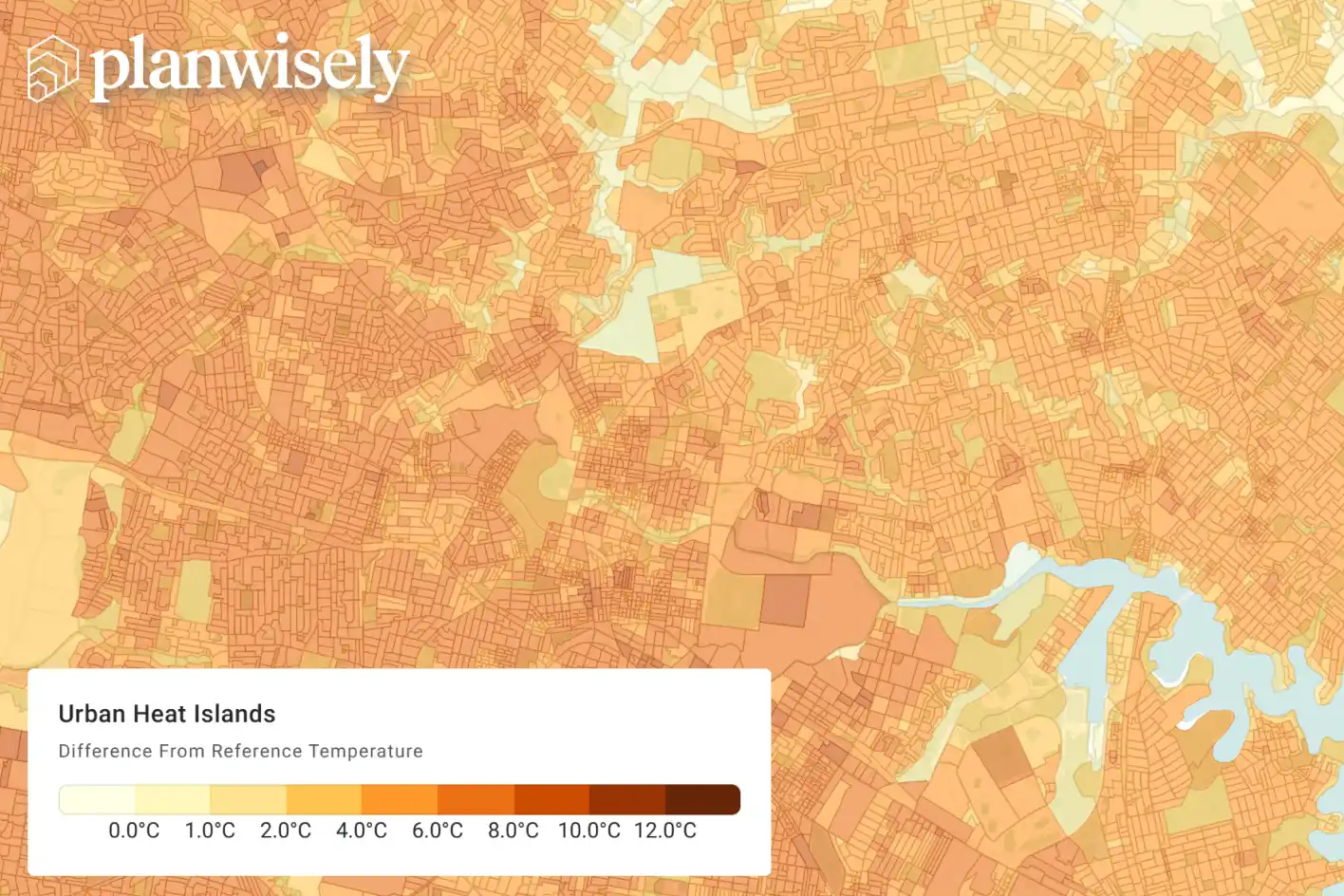
At the heart of urban heat analysis is Land Surface Temperature (LST) data, which is typically captured using satellites. These datasets make it possible to map temperature variations across cities with high spatial resolution.
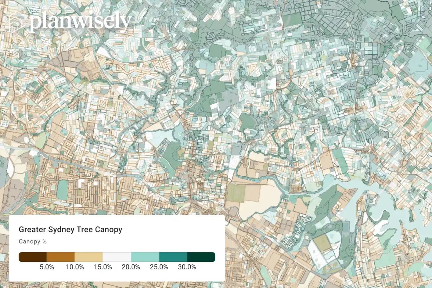
In Australia, LST data has revealed stark contrasts between urban and surrounding rural areas—often showing temperature differences of 2–12°C or more. Western Sydney, for example, consistently records higher surface temperatures than its coastal counterparts, largely due to its built environment and lower tree canopy coverage.
By layering LST data over urban maps, planners can pinpoint hotspots, track changes over time, and assess the effectiveness of cooling interventions like tree planting or reflective surfaces.


.jpg)

